Custom Progress View in SwiftUI
Reading time: 3 min
This recipe shows how to customize a Progress view by implementing a custom ProgressViewStyle. You'll implement a circular progress bar that supports both definite and indefinite progress.
The end result will look like this:
Progress view and ProgressViewStyle were introduced in SwiftUI 2 (iOS 14, macOS 11).
You can find the full code for the configurable RingProgressViewStyle component in this repo.
As usual, implementing a custom View Style involves implementing a makeBody, which takes a Configuration as a parameter. ProgressViewStyleConfiguration gives you three things to work with:
- The label of the progress view.
- Label for the current value.
- Fraction of the completed progress. If the progress view is indefinite, this value will be
nil. Otherwise, it'll show how much progress should the view render, between 0 and 1.
Our custom style will vertically stack the progress view label, the circles showing the progress and the current value label. Let's get started!
Definite circular progress bar
public struct RingProgressViewStyle: ProgressViewStyle {
private let defaultSize: CGFloat = 36 // size of the progress circle
private let lineWidth: CGFloat = 6 // line thickness of the circle
private let defaultProgress = 0.0 // will make more sense for indefinite progress
public func makeBody(configuration: ProgressViewStyleConfiguration) -> some View {
// stack the views from configuration vertically
VStack {
configuration.label
progressCircleView(fractionCompleted: configuration.fractionCompleted ?? defaultProgress)
configuration.currentValueLabel
}
}
private func progressCircleView(fractionCompleted: Double) -> some View {
// this is the circular "track", which is a full circle at all times
Circle()
.strokeBorder(Color.gray.opacity(0.5), lineWidth: lineWidth, antialiased: true)
// render the fill circle above
.overlay(fillView(fractionCompleted: fractionCompleted))
.frame(width: defaultSize, height: defaultSize)
}
private func fillView(fractionCompleted: Double) -> some View {
Circle() // the fill view is also a circle
// trim renders only a percentage of the full path, perfect for us!
.trim(from: 0, to: CGFloat(fractionCompleted))
// set the fill color here
.stroke(Color.secondary, lineWidth: lineWidth)
// we use overlay, so we need to modify the frame a bit
.frame(width: defaultSize - lineWidth, height: defaultSize - lineWidth)
// circles start at 3 o'clock, so we rotate them back a bit to 12 o'clock
.rotationEffect(.degrees(-90))
}
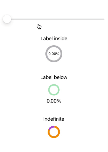
}Great! Let's put together a simple test view to see it in action:
@State private var progress = 0.0

var body: some View {
  VStack(spacing: 40) {
   Slider(value: $progress, in: 0.0...1.0) {
     Text("Slider")
   }

   ProgressView(value: progress, total: 1.0) {
     Text("Label inside")
    } currentValueLabel: {
      Text(String(format: "%0.2f%%", progress))
    }.progressViewStyle(RingProgressViewStyle())
}
And this is what it looks like:

Supporting indefinite progress view
Now we'll tweak the code above slightly to support indefinite mode as well. For the indefinite mode, we'll spin a 20% fill arc around the track infinitely.
public struct RingProgressViewStyle: ProgressViewStyle {
  private let defaultSize: CGFloat = 36
  private let lineWidth: CGFloat = 6
  private let defaultProgress = 0.2 // CHANGE

  // tracks the rotation angle for the indefinite progress bar
  @State private var fillRotationAngle = Angle.degrees(-90) // ADD

  public func makeBody(configuration: ProgressViewStyleConfiguration) -> some View {
    VStack {
      configuration.label
      progressCircleView(fractionCompleted: configuration.fractionCompleted ?? defaultProgress,
               isIndefinite: configuration.fractionCompleted == nil) // UPDATE
      configuration.currentValueLabel
    }
  }

  private func progressCircleView(fractionCompleted: Double,
                              isIndefinite: Bool) -> some View { // UPDATE
     // this is the circular "track", which is a full circle at all times
    Circle()
      .strokeBorder(Color.gray.opacity(0.5), lineWidth: lineWidth, antialiased: true)
      .overlay(fillView(fractionCompleted: fractionCompleted, isIndefinite: isIndefinite)) // UPDATE
      .frame(width: defaultSize, height: defaultSize)
  }

  private func fillView(fractionCompleted: Double,
                              isIndefinite: Bool) -> some View { // UPDATE
    Circle() // the fill view is also a circle
      .trim(from: 0, to: CGFloat(fractionCompleted))
      .stroke(Color.secondary, lineWidth: lineWidth)
      .frame(width: defaultSize - lineWidth, height: defaultSize - lineWidth)
      .rotationEffect(fillRotationAngle) // UPDATE
      // triggers the infinite rotation animation for indefinite progress views
      .onAppear {
        if isIndefinite {
          withAnimation(.easeInOut(duration: 1).repeatForever()) {
            fillRotationAngle = .degrees(270)
          }
        }
      }
  }
}
All done! Now, you can add this indefinite progress view to your test view from above:
ProgressView("Indefinite")
  .progressViewStyle(RingProgressViewStyle())