SwiftUI Toolbar Placement Cheatsheet
Reading time: 5 min
This recipe is a cheatsheet for various ToolbarItemPlacement values and combinations on iOS. This is useful because:
- The namings of the placement values don't necessarily clearly depict where will a
ToolbarItemend up. - Some values don't play well with each other. E.g,
.primaryActionwill hide.confirmationActionif it's placed above it, but not if placed below. - Some positions change if
TitleDisplayModeis.inline.
First we'll quickly introduce the toolbar modifier, and then we'll look at how do various item placements and their combinations look on iOS.
TL;DR Here are the links to the bottom bar summary and navigation bar summary.
Intro to Toolbars
iOS 14 introduced the toolbar modifier, allowing you to add ToolbarItems to either the toolbar (bottom bar) or the navigation bar. Note that this only works for views that are embedded in a NavigationView (either directly, or become via the navigation stack).
Here's a simple example that adds a few buttons around:
Note: The example uses the blueNavigation modifier from this recipe on Navigation Bar Styling.
struct ToolbarTestView: View {
  var body: some View {
    NavigationView { // 1
      Text("Hello, World!")
        .padding()
        .navigationTitle("Toolbar Tester")
        .blueNavigation
        .toolbar { // 2
          ToolbarItem(placement: .navigation) { // 3
            Button("Navigation") { } // 4
          }
          ToolbarItem(placement: .bottomBar) { // 3
            Button("BottomBar") { } // 4
          }
        }
    }
  }
}
What happens here is:
- Views that use
toolbarmust be embedded inNavigationView. Alternatively, the view from which you navigated to viaNavigationLinkshould be. - Use the same
toolbarmodifier for all items, regardless of if they're in the navigation bar or bottom bar. - Use the
ToolbarItemwrapper to add items to the bar and specify the position withplacement:. - Add a regular
Buttonwith a title and empty action.
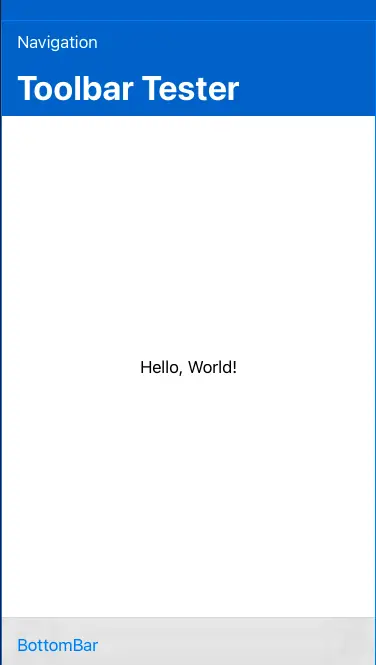
The result looks like this. You can see two buttons, one added to the navigation bar and one to the bottom toolbar:

Okay, time to dive into all the placements and their combos!
ToolbarItemPlacement and its values
The ToolbarItemPlacement is a struct with a bunch of static constants representing different toolbar placements (you can think of it as an enum, even though it's not implemented that way). Here are all the supported placement values:
automaticprincipalnavigationprimaryActionstatusconfirmationActioncancellationActiondestructiveActionnavigationBarLeadingnavigationBarTrailingbottomBar
We'll look at the placements that affect the bottom space (bottom toolbar) and the top space (navigation bar) separately, as they don't affect each other.
Fot the sake of brevity, example will just show the code inside the toolbar modifier block.
Bottom bar placements
The bottom bar placements are status and bottomBar.
ToolbarItem(placement: ToolbarItemPlacement.status) {
  Button("Status") { }
}
ToolbarItem(placement: ToolbarItemPlacement.bottomBar) {
  Button("BottomBar") { }
}
statusis placed in the center of the toolbar.bottomBarstarts from the leading edge of the toolbar.
If you add another bottomBar to the list:
ToolbarItem(placement: ToolbarItemPlacement.bottomBar) {
  Button("BottomBar2") { }
}
it goes to the trailing edge:

If you keep adding more bottomBar items:
ToolbarItem(placement: ToolbarItemPlacement.bottomBar) {
  Button("BottomBar3") { }
}
they'll keep lining up at the trailing edge:

Multiple status items:
ToolbarItem(placement: ToolbarItemPlacement.status) {
  Button("Status") { }
}
ToolbarItem(placement: ToolbarItemPlacement.status) {
  Button("Status2") { }
}
are just sequentially lined up in the center (if possible):


Summary:
statusitems(s) are placed in the center.- First
bottomBaritems goes to the leading edge. - Other
bottomBaritems go to the trailing edge. - The mix sort of works as you would expect.
Navigation bar placements
Things get a bit more complicated with the navigation bar placements, as there are many overlapping ones:
automatic,primaryAction,confirmationAction,destructiveActionandnavigationBarTrailingall compete for the navigation bar trailing position.navigation,cancellationActionandnavigationBarLeadingcompete for the navigation bar leading position.principalis the only one placed in the center of the navigation bar.
Here's a quick code to illustrate where do these placements live:
ToolbarItem(placement: ToolbarItemPlacement.automatic) {
  Button("Automatic") { }
}
ToolbarItem(placement: ToolbarItemPlacement.principal) {
  Button("Principal") { }
}
ToolbarItem(placement: ToolbarItemPlacement.navigation) {
  Button("Navigation") { }
}
Here's where things get more than a little fuzzy. If you line up all the trailing placement options, like this:
ToolbarItem(placement: ToolbarItemPlacement.automatic) {
  Button("Automatic") { }
}
ToolbarItem(placement: ToolbarItemPlacement.navigationBarTrailing) {
  Button("NavigationBarTrailing") { }
}
ToolbarItem(placement: ToolbarItemPlacement.primaryAction) {
  Button("PrimaryAction") { }
}
ToolbarItem(placement: ToolbarItemPlacement.confirmationAction) {
  Button("ConfirmationAction") { }
}
ToolbarItem(placement: ToolbarItemPlacement.destructiveAction) {
  Button("DestructiveAction") { }
}
you'll only get the automatic one:

If you place the primaryAction above navigation, then "Primary" goes to top.
However, if you place navigationBarTrailing above primaryAction, you get something like this:

Moral of the story is don't mix competing modifiers together - pick one and stick with it. The combination of placements and their ordering (which item is placed above the other in code) both seem to matter and the results are just weird.
The same is true for leading placement options.
ToolbarItem(placement: ToolbarItemPlacement.navigation) {
  Button("Navigation") { }
}
ToolbarItem(placement: ToolbarItemPlacement.cancellationAction) {
  Button("CancellationAction") { }
}
ToolbarItem(placement: ToolbarItemPlacement.navigationBarLeading) {
  Button("NavigationBarLeading") { }
}
navigation on top eats up everything:

But if it goes to the bottom:
ToolbarItem(placement: ToolbarItemPlacement.cancellationAction) {
  Button("CancellationAction") { }
}
ToolbarItem(placement: ToolbarItemPlacement.navigationBarLeading) {
  Button("NavigationBarLeading") { }
}

ToolbarItem(placement: ToolbarItemPlacement.navigation) {
  Button("Navigation") { }
}
you get all the buttons:

Also, note that having more than one navigation, principal or automatic item has no effect - it always only displays the top one. Multiplying items works for other placement types.
For the last test, let's use the inline navigation bar title. Change the navigationTitle line to:
.navigationBarTitle("Toolbar Tester", displayMode: .inline)With a navigation and confirmationAction items, it looks like this:

However, if you add a principal, it covers up the title:

Summary:
- Trailing -
automatic,primaryAction,confirmationAction,destructiveActionandnavigationBarTrailing. - Leading -
navigation,cancellationActionandnavigationBarLeading. - Principal - center.
automaticandnavigationcover up all the other placements in equal positioning.automatic,navigationandprincipaldon't allow duplication, other placement options do.confirmationActionhas default bold text.- In the
inlinedisplay mode,principalreplaces the title. - Generally, don't mix these placement options together. Pick one for leading/trailing and stick with it.