Reading time: 2 min
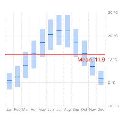
This recipe shows a more advanced SwiftUI bar chart that shows min, max and average for each data point.
The end result looks like this:

Charts framework is available starting in SwiftUI 4 (iOS 16, macOS 12.4).
Let's start off by creating a simple structure that represent air temperature in the city of Osijek, tracking minimal, maximal and mean values for each month. This is the data we'll be plotting in a bar chart.
struct Temperature {
  let month: Int
  let min: Int
  let max: Int
  let mean: Float
}

let data: [Temperature] = [
  Temperature(month: 1, min: -3, max: 4, mean: 0.8),
  Temperature(month: 2, min: -2, max: 7, mean: 2.4),
  Temperature(month: 3, min: 2, max: 13, mean: 7.2),
  Temperature(month: 4, min: 6, max: 18, mean: 12.3),
  Temperature(month: 5, min: 11, max: 23, mean: 17.1),
  Temperature(month: 6, min: 14, max: 27, mean: 20.5),
  Temperature(month: 7, min: 16, max: 29, mean: 22.2),
  Temperature(month: 8, min: 15, max: 29, mean: 22.1),
  Temperature(month: 9, min: 11, max: 23, mean: 17.3),
  Temperature(month: 10, min: 7, max: 18, mean: 12.5),
  Temperature(month: 11, min: 3, max: 11, mean: 6.9),
  Temperature(month: 12, min: -1, max: 5, mean: 1.6),
]
Instead of regular BarMark(x:y:), you can use BarMark(x:yStart:yEnd) to define the height of the bar relative to chart's Y axis. Then, use RectangleMark to draw a line on top of each bar to represent the average temperature for that month:
Chart {
  ForEach(data, id: \.month) { temperature in
    let month = Calendar.current.date(from: DateComponents(month: temperature.month))!
    BarMark(x: .value("Month", month, unit: .month),
            yStart: .value("Temperature", temperature.min),
            yEnd: .value("Temperature", temperature.max),
            width: .ratio(0.6))
      .opacity(0.3)

    RectangleMark(x: .value("Month", month, unit: .month),
                  y: .value("Temperature", temperature.mean),
                  width: .ratio(0.6),
                  height: .fixed(2))
  }
}
To draw a line indicating yearly average temperature, add a RuleMark with annotation:
Chart {
  // ... same as before ...

  let average = data.map(\.mean).reduce(0.0, +) / Float(data.count)
  RuleMark(y: .value("Mean", average))
    .foregroundStyle(.red)
    .lineStyle(StrokeStyle(lineWidth: 2))
    .annotation(position: .bottom, alignment: .trailing) {
      Text("Mean: \(average, format: .number.precision(.fractionLength(1)))")
        .font(.body.bold())
        .foregroundStyle(.red)
    }
}
Finally, you can modify the Y axis labels, just like we did in this recipe:
Chart {
  // ... same as before ...
}
.chartXAxis {
  AxisMarks(values: .stride(by: .month)) { _ in
    AxisGridLine()
    AxisTick()
    AxisValueLabel(format: .dateTime.month(.abbreviated), centered: true)
  }
}
.chartYAxis {
  AxisMarks(values: .automatic(desiredCount: 4)) { value in
    AxisGridLine()
    AxisTick()
    AxisValueLabel {
      if let plottable = value.as(Int.self) {
        Text("\(plottable) °C")
      }
    }
  }
}