Styling SwiftUI Chart with Charts Framework
Reading time: 3 min
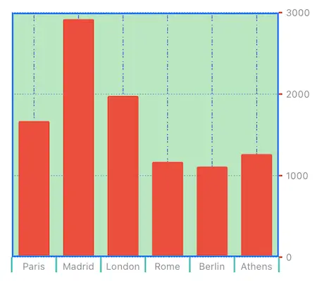
This recipe shows how to add a style SwiftUI Charts using Apple's new Charts Framework. You can change the colors, line styles and visibility of all parts of the chart, including its plot area, marks and axes.
The end result looks like this:

Charts framework is available starting in SwiftUI 4 (iOS 16, macOS 12.4).
Sample data & bar chart
Let's start off by creating a simple structure that represents driving distance of European capitals from the city of Osijek. This is the data we'll be plotting in a bar chart.
struct Distance: Hashable {
  let city: String
  let distance: Int
}

let data: [Distance] = [
  Distance(city: "Paris", distance: 1672),
  Distance(city: "Madrid", distance: 2922),
  Distance(city: "London", distance: 1977),
  Distance(city: "Rome", distance: 1171),
  Distance(city: "Berlin", distance: 1110),
  Distance(city: "Athens", distance: 1268)
]

struct StyledChartTest: View {
  var body: some View {
    Chart {
      ForEach(data, id: \.self) { distance in
        BarMark(x: .value("City", distance.city),
                y: .value("Distance", distance.distance))
      }
    }
  }
}
Chart Marks Color
Change the color of chart marks (the bars, in this case) using foregroundStyle on the marks themselves:
Chart {
  ForEach(data, id: \.self) { distance in
    BarMark(x: .value("City", distance.city),
            y: .value("Distance", distance.distance))
    .foregroundStyle(Color.red) // HERE
  }
}
Chart Background Color and Border
Change the background color of the chart and add a border to it with chartPlotStyle. You can apply a variety of modifiers on the ChartPlotContent parameter it provides:
Chart {
  // ... same as before ...
}
.chartPlotStyle { plotContent in
  plotContent
    .background(.green.opacity(0.4))
    .border(Color.blue, width: 2)
}
Axis Marks, Ticks and Labels
You can style the chart axes with chartXAxis and chartYAxis, respectively. Within it, create an AxisMarks instance and then add appropriate structs to modify different parts of the axis:
AxisGridLineis the line that runs across the plot area to indicate a reference point along a particular axis.AxisTickis the mark that a chart draws on an axis to indicate a reference point along that axis.AxisValueLabelis the label that describes the value on the axis mark.
Omitting any of the three options above will also remove it from the chart.
Here's some code that shows all of it in action:
Chart {
  // ... same as before ...
}
.chartPlotStyle { plotContent in
  // ... same as before ...
}
.chartXAxis {
  AxisMarks(values: .automatic) { _ in
    AxisGridLine(centered: true, stroke: StrokeStyle(dash: [1, 2, 4]))
      .foregroundStyle(Color.indigo)
    AxisTick(stroke: StrokeStyle(lineWidth: 2))
      .foregroundStyle(Color.mint)
    AxisValueLabel()
  }
}
.chartYAxis {
  AxisMarks(values: .automatic) { _ in
    AxisGridLine(centered: true, stroke: StrokeStyle(dash: [1, 2]))
      .foregroundStyle(Color.cyan)
    AxisTick(centered: true, stroke: StrokeStyle(lineWidth: 2))
      .foregroundStyle(Color.red)
    AxisValueLabel()
  }
}
Value Label Font and Color
Styling value labels is also a different beast. While you can set font and foregroundStyle on AxisValueLabel, they unfortunately have no effect on the label appearance. The correct approach is to construct a custom Text and then style it, just like we did in this recipe:
.chartYAxis {
  AxisMarks(values: .automatic) { value in
    AxisGridLine(centered: true, stroke: StrokeStyle(dash: [1, 2]))
      .foregroundStyle(Color.cyan)
    AxisTick(centered: true, stroke: StrokeStyle(lineWidth: 2))
      .foregroundStyle(Color.red)
    AxisValueLabel() { // construct Text here
      if let intValue = value.as(Int.self) {
        Text("\(intValue) km")
          .font(.system(size: 10)) // style it
          .foregroundColor(.blue)
      }
    }
  }
}