Reading time: 1 min
This tutorial shows how to create a custom Swiftui Button style with distinct disabled and pressed states.
The end result will look like this:
| Default | Pressed | Disabled |
|---|---|---|
 |
 |
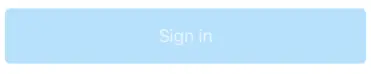 |
Let's get down to business! First, define three colors that represent the default and disabled state. Also throw in a pale white color for the disabled text:
extension Color {
  static let defaultBlue = Color(red: 0, green: 97 / 255.0, blue: 205 / 255.0)
  static let paleBlue = Color(red: 188 / 255.0, green: 224 / 255.0, blue: 253 / 255.0)
  static let paleWhite = Color(white: 1, opacity: 179 / 255.0)
}
Then, create a custom View representing the Button content, and wrap it in a ButtonStyle:
struct MyButtonStyle: ButtonStyle {
  func makeBody(configuration: Self.Configuration) -> some View {
    MyButtonStyleView(configuration: configuration)
  }
}

private extension MyButtonStyle {
  struct MyButtonStyleView: View {
    // tracks if the button is enabled or not
    @Environment(\.isEnabled) var isEnabled
    // tracks the pressed state
    let configuration: MyButtonStyle.Configuration

    var body: some View {
      return configuration.label
        // change the text color based on if it's disabled
        .foregroundColor(isEnabled ? .white : .paleWhite)
        .background(RoundedRectangle(cornerRadius: 5)
          // change the background color based on if it's disabled
          .fill(isEnabled ? Color.defaultBlue : Color.paleBlue)
        )
        // make the button a bit more translucent when pressed
        .opacity(configuration.isPressed ? 0.8 : 1.0)
        // make the button a bit smaller when pressed
        .scaleEffect(configuration.isPressed ? 0.98 : 1.0)
    }
  }
}
Lastly, just wrap it all up in a custom View that makes use of this new style:
struct MyButton: View {
  let title: String
  let action: () -> Void

  var body: some View {
    Button(action: action) {
      Text(self.title)
        .padding()
    }.buttonStyle(MyButtonStyle())
  }
}