Easy Tooltips in SwiftUI with TipKit
Reading time: 2 min
This recipe shows how to quickly implement floating tooltips to guide users in your app. It relies on TipKit for managing tooltip appearance and their state.
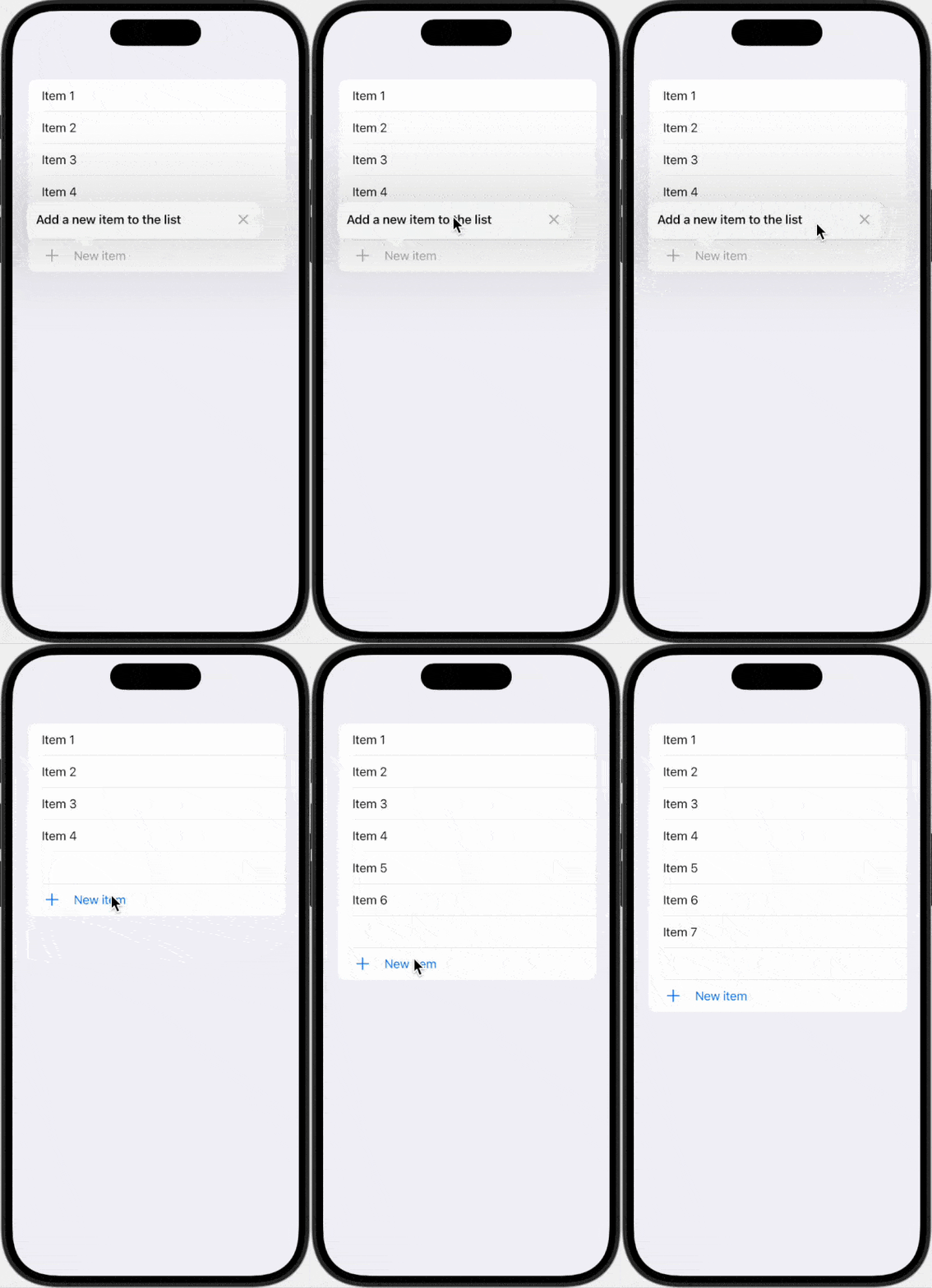
The end result looks like this:

This code works starting with iOS 17 and macOS 14.
Basic tooltip
There are three basic steps to showing a tooltip over a view in your app:
- Defining a type that conforms to
Tip. - Associate the tip with a
Viewin your screen. - Configure
Tipsin yourAppstruct.
The Tip type
Start off by implementing a type that conforms to the Tip protocol. Usually, an enum is a perfect candidate for it, since you'll most likely want a number of distinct tooltips. Conforming to the Tip protocol allows you to specify what the tooltip will look like - its only required property is title that returns a Text:
import TipKit

enum Tooltip: Tip, CaseIterable {
  case add

  var title: Text {
    switch self {
    case .add:
      return Text("Add a new item to the list")
    }
  }
}
Associating the tip with a View
Showing a tooltip above a view is trivial - just use the popoverTip modifier. Here's a sample view that showcases the functionality:
struct TooltipTest: View {
  @State private var count = 5

  var body: some View {
    List {
      ForEach(1..<count, id: \.self) { item in
        Text("Item \(item)")
      }
      Spacer()

      Button("New item", systemImage: "plus", action: {
        count += 1
      })
      .popoverTip(Tooltip.add) // HERE
    }
  }
}
Configuring tips
The final step is to actually tell TipKit to figure out which tooltips you've defined and where should they be shown. To do this, go to your App struct and add the following to its initializer:
import TipKit

@main
struct MyApp: App {
  init() {
    try? Tips.configure()
  }
}
And that's it! Now you can see tips in your app:

If you did everything properly, you'll be able to see tips even in previews. However, in order to make them appear every time, use the following config in your App initializer:
init() {
  try? Tips.configure([.displayFrequency(.immediate)])
  try? Tips.resetDatastore()
  Tips.showAllTipsForTesting()
}
Extra - standalone tooltips
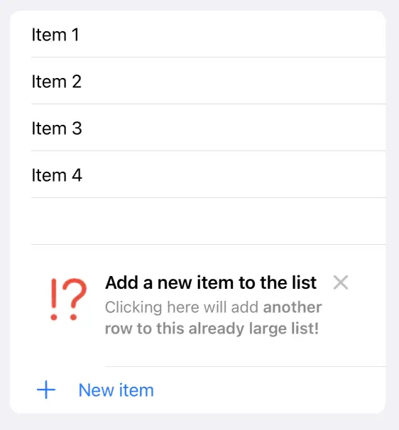
While the most common use-case is to display a tooltip over a view on the screen, sometimes you might want to display a dismissable standalone tooltip that appears as a regular view, not floating above another one. In that case, you can use TipView, which is, well, a view that displays a Tip-conforming type:
List {
      ForEach(1..<count, id: \.self) { item in
        Text("Item \(item)")
      }
      Spacer()

      TipView(Tooltip.add) // HERE

      Button("New item", systemImage: "plus", action: {
        count += 1
      })

    }
Resulting in:

Next time, we'll take a look at how tips can be styled, how to show a group of them and how to manage their storage!