Reading time: 1 min
This recipe shows how to manage status bar in SwiftUI - set background color and material, as well as how to show and hide it.
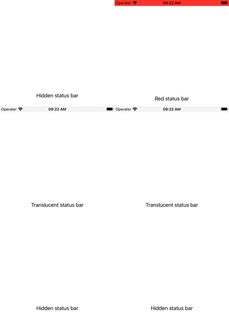
The end result looks like this:

You can change the status bar's color and material by inserting a small view right behind it. Normally, all views are positioned below the status bar, but you can use edgesIgnoringSafeArea(.top) to push it past the safe area insets.
Material is available starting with SwiftUI 3 (iOS 15, macOS 12). If you need to support earlier versions, just drop that part from the recipe code.
Showing and hiding the status bar is easy enough, there's a dedicated statusBar(hidden:) modifier that regulates its visibility.
Here's the full code of a view modifier that can fully style a status bar:
struct StatusBarStyleModifier: ViewModifier {
  let color: Color
  let material: Material
  let hidden: Bool

  func body(content: Content) -> some View {
    ZStack {
      // View inserted behind the status bar
      VStack {
        GeometryReader { geo in
          color
            .background(material) // SwiftUI 3+ only
            .frame(height: geo.safeAreaInsets.top)
            .edgesIgnoringSafeArea(.top)
          Spacer()
        }
      }

      content
    }
    .statusBar(hidden: hidden) // visibility
  }
}

extension View {
  func statusBarStyle(color: Color = .clear,
                      material: Material = .bar,
                      hidden: Bool = false) -> some View {
    self.modifier(StatusBarStyleModifier(color: color,
                                         material: material,
                                         hidden: hidden))
  }
}
Then, you can use it like this:
struct StatusBarStyleTest: View {
  var body: some View {
    TabView {
      Text("Red status bar")
        .statusBarStyle(color: .red)
        .tabItem { Text("Red") }

      Text("Translucent status bar")
        .statusBarStyle(material: .ultraThinMaterial)
        .tabItem { Text("Translucent") }

      Text("Hidden status bar")
        .statusBarStyle(hidden: true)
        .tabItem { Text("Hidden") }
    }
  }
}