Radial Menu in SwiftUI
Reading time: 4 min
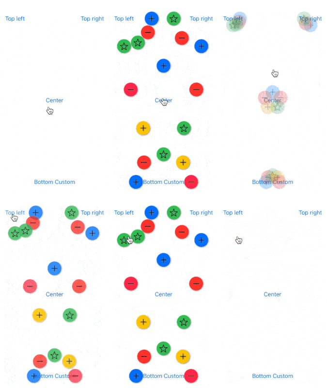
This recipe shows how to implement a radial /circular / arc menu in SwiftUI. A radial menu positions its elements on an arc at a set distance from an anchor view. It is also commonly used in conjunction with a floating action button.
The end result looks like this:

In this recipe, the radial menu is attached as a ViewModifier to another view, which serves as its anchor point. You can trigger opening and closing of the menu using the isShowing binding, with opening and closing animated by default. You can also specify the following parameters:
anchorPosition- defines how the buttons are spread out, i.e the start and end angle of the arc on which the menu views sit. You do that by telling where exactly does the anchor view sit in terms of its parent view. E.g, if you set it totopLeft, the buttons will occupy the 90 degree arc between the top of the screen and its left edge.- You can always use the
customanchor position and define the arc yourself.
- You can always use the
distance- the distance at which the menu views sit from the anchor view.autoClose- if the menu should automatically close whenever you tap on an item.buttons- the actual menu items, which are, in this example, rendered as colored circles with an image in the center.
You can use pretty much any views for the buttons, as long as they have a fixed-size frame. Play around with different combos and see what works best for you!
OK, here's the full code for the modifier:
// The button data holder
struct RadialMenuButton {
  let color: Color
  let image: String
  let size: CGFloat
  let action: () -> Void
}

struct RadialMenu: ViewModifier {
  @Binding var isShowing: Bool
  let anchorPosition: AnchorPosition
  let distance: CGFloat
  let autoClose: Bool
  let buttons: [RadialMenuButton]

  func body(content: Content) -> some View {
    ZStack {
      content
      radialMenu
    }
  }

  // This might look complicated, but it just figures out the angle
  // between subsequent menu items. Since their spread can be on any
  // arc, it needs to do the check to prevent first and last item
  // from overlapping.
  private var angleDelta: Double {
    let span = anchorPosition.endAngle - anchorPosition.startAngle
    let n = buttons.count
    let nMinus1 = n - 1
    let candidate = span / Double(nMinus1)
    let point0 = pointFor(angleDelta: candidate, index: 0)
    let point1 = pointFor(angleDelta: candidate, index: 1)
    let pointN = pointFor(angleDelta: candidate, index: nMinus1)
    return (hypot(point0.x - point1.x, point0.y - point1.y) > hypot(point0.x - pointN.x, point0.y - pointN.y))
      ? span / Double(n)
      : candidate
  }

  // The offset from the anchor point for the button at the given index.
  private func pointFor(angleDelta: Double, index: Int) -> CGPoint {
    let angle = anchorPosition.startAngle + angleDelta * Double(index)
    return CGPoint(x: distance * cos(angle), y: distance * sin(angle))
  }

  @ViewBuilder private var radialMenu: some View {
    let angle = angleDelta
    ZStack {
      ForEach(0..<buttons.count) { i in
        radialMenuButton(buttons[i],
                         offset: pointFor(angleDelta: angle, index: i))
      }
    }
  }

  private func radialMenuButton(_ button: RadialMenuButton,
                                offset: CGPoint) -> some View {
    return Image(systemName: button.image)
      .imageScale(.large)
      .frame(width: button.size, height: button.size)
      .background(Circle().fill(button.color))
      .shadow(color: .gray, radius: 2, x: 1, y: 1)
      .onTapGesture {
        button.action()
        if autoClose {
          isShowing.toggle()
        }
      }
      .offset(x: isShowing ? 0 : offset.x,
              y: isShowing ? 0 : offset.y)
      .opacity(isShowing ? 0 : 1)
      .animation(.spring().speed(1))
      // in SwiftUI 3, use animation(.spring().speed(1), value: isShowing)
  }

  enum AnchorPosition {
    case topLeft,
         topRight,
         bottomLeft,
         bottomRight,
         center,
         custom(Angle, Angle)

    var startAngle: Double {
      switch self {
      case .topLeft:
        return 0
      case .topRight:
        return .pi / 2
      case .bottomLeft:
        return 3 * .pi / 2
      case .bottomRight:
        return .pi
      case .center:
        return -.pi / 2
      case .custom(let startAngle, _):
        return startAngle.radians
      }
    }

    var endAngle: Double {
      switch self {
      case .center:
        return 3 * .pi / 2
      case .custom(_, let endAngle):
        return endAngle.radians
      default:
        return startAngle + .pi / 2
      }
    }
  }
}
Then, to make things easier to use, add this extension:
extension View {
  func radialMenu(isShowing: Binding<Bool>,
                  anchorPosition: RadialMenu.AnchorPosition,
                  distance: CGFloat,
                  autoClose: Bool,
                  buttons: [RadialMenuButton]) -> some View {
    self.modifier(RadialMenu(isShowing: isShowing,
                             anchorPosition: anchorPosition,
                             distance: distance,
                             autoClose: autoClose,
                             buttons: buttons))
  }
}
Finally, here's some sample usage, resulting in "Custom Bottom" view shown in the image above:
var body: some View {
  ZStack(alignment: .bottom) {
    Color.clear
    Button("Bottom Custom") {
      isShowing.toggle()
    }
    .radialMenu(isShowing: $isShowing,
                anchorPosition: .custom(.degrees(180), .degrees(360)),
                distance: 80,
                autoClose: true,
                buttons: [
                  RadialMenuButton(color: .blue, image: "plus", size: 40, action: {
                    print("A")
                  }),
                  RadialMenuButton(color: .red, image: "minus", size: 40, action: {
                    print("B")
                  }),
                  RadialMenuButton(color: .green, image: "star", size: 40, action: {
                    print("C")
                  }),
                  RadialMenuButton(color: .yellow, image: "plus", size: 40, action: {
                    print("D")
                  }),
                  RadialMenuButton(color: .pink, image: "minus", size: 40, action: {
                    print("E")
                  }),
                ])
  }
}