18
Jul
2022
SwiftUI Gauge Cheatsheet
Reading time: 1 min
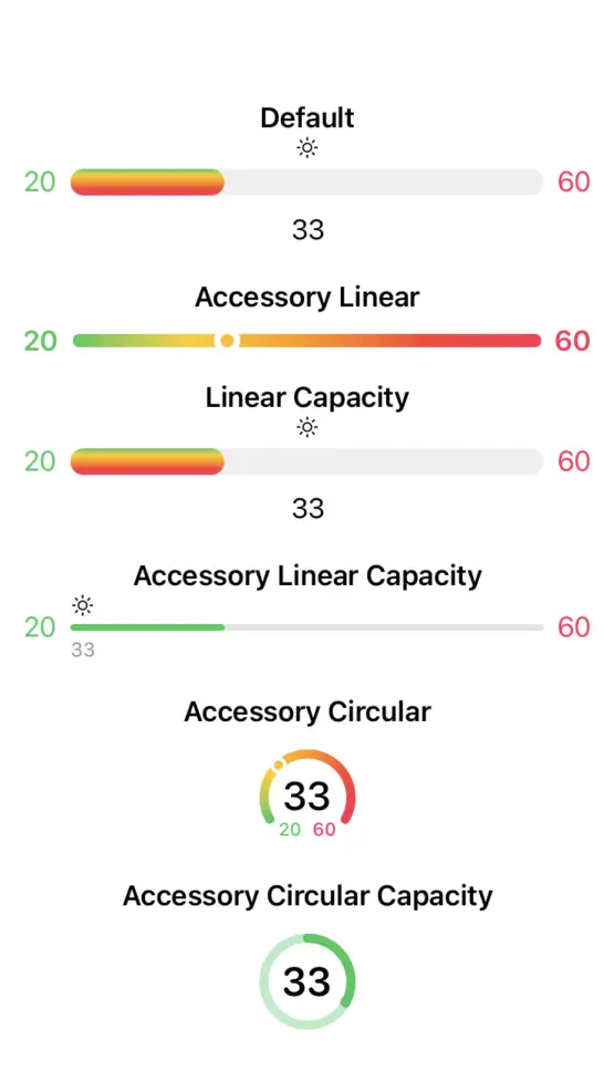
This recipe is a cheatsheet on all the possible SwiftUI Gauge styles, as well as how to set tint and all the labels.
You can see the cheatsheet below and the takeaways here:

Gauge is available starting in SwiftUI 4 (iOS 16, macOS 12.4).
Here's the code used to produce the view shown above. As you can see, Gauge views were configured to their fullest extent, with a label, currentValueLabel, minimumValueLabel, maximumValueLabel, style and tint.
struct GaugeViewCheatsheet: View {
  @State private var current = 33.0
  @State private var minimum = 20.0
  @State private var maximum = 60.0

  var body: some View {
    VStack(spacing: 20) {
      embeddedGauge(title: "Default") {
        gauge.gaugeStyle( DefaultGaugeStyle())
      }
      embeddedGauge(title: "Accessory Linear") {
        gauge.gaugeStyle( AccessoryLinearGaugeStyle())
      }
      embeddedGauge(title: "Linear Capacity") {
        gauge.gaugeStyle( LinearCapacityGaugeStyle())
      }
      embeddedGauge(title: "Accessory Linear Capacity") {
        gauge.gaugeStyle( AccessoryLinearCapacityGaugeStyle())
      }
      embeddedGauge(title: "Accessory Circular") {
        gauge.gaugeStyle( AccessoryCircularGaugeStyle())
      }
      embeddedGauge(title: "Accessory Circular Capacity") {
        gauge.gaugeStyle( AccessoryCircularCapacityGaugeStyle())
      }
    }
    .padding()
  }

  private var gauge: some View {
    Gauge(value: current, in: minimum...maximum) {
      Image(systemName: "sun.max")
        .font(.caption)
    } currentValueLabel: {
      Text("\(Int(current))")
    } minimumValueLabel: {
      Text("\(Int(minimum))")
        .foregroundColor(.green)
    } maximumValueLabel: {
      Text("\(Int(maximum))")
        .foregroundColor(.pink)
    }
    .tint(Gradient(colors: [.green, .yellow, .orange, .red, .pink]))
  }

  @ViewBuilder private func embeddedGauge<StyledGauge: View>(
    title: String,
    @ViewBuilder gauge: () -> StyledGauge
  ) -> some View {
    VStack {
      Text(title)
        .font(.headline)
      gauge()
    }
  }
}
Here are the takeaways from the cheatsheet:
.linearCapacityis the.defaultstyle.- Only
.linearCapacity/.defaultand.accessoryLinearCapacityshow thelabelview. - All styles except
.accessoryCircularCapacityshow theminimumValueLabelandmaximumValueLabelviews. - All styles except
.accessoryLinearshow thecurrentValueLabelview. - Gradient
tintis is applied vertically to.linearCapacity/.defaultand horizontally to.accessoryLinearand.accessoryCircular. In the case of.accessoryLinearCapacityand.accessoryCircularCapacity, only the first color of the gradient is used.