Responsive SwiftUI with ViewThatFits
Reading time: 1 min
This recipe shows how to implement responsive, adaptive SwiftUI layouts using ViewThatFits. This view adapts to the available space by providing the first child view that fits.
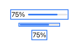
The end result looks like this:

ViewThatFits is available starting in SwiftUI 4 (iOS 16, macOS 12.4).
Responsive views change based on the available space in their superviews. Consider a custom progress indicator: if you have enough space, you'd like to display a progress bar and a text view indicating the current progress. If there's less space available, you're fine with showing just the progress bar and if the layout is even more tight, just the text field suffices.
ViewThatFits will attempt to render each of its child views consecutively until it finds one that fits. This means that you'd normally put "larger" views before "smaller" ones:
struct CustomProgressView: View {
  @State var progress: Double

  var body: some View {
    // chooses based on available horizontal space
    ViewThatFits(in: .horizontal) {
      HStack { // largest variant
        textView
        progressView
      }
      progressView
      textView // smallest variant
    }
    .padding(3)
    .background(Rectangle() // background to showcase view bounds
      .foregroundColor(.clear)
      .border(Color.blue, width: 2))
  }

  private var textView: some View {
    Text("\(progress.formatted(.percent))")
  }

  private var progressView: some View {
    ProgressView(value: progress)
      .frame(width: 100)
  }
}
And here's a showcase setup, in which all three variants of CustomProgressView are shown by manually constraining them with frame:
VStack {
  CustomProgressView(uploadProgress: 0.75)
    .frame(maxWidth: 200)
  CustomProgressView(uploadProgress: 0.75)
    .frame(maxWidth: 110)
  CustomProgressView(uploadProgress: 0.75)
    .frame(maxWidth: 50)
}