SwiftUI Radio Buttons
Reading time: 2 min
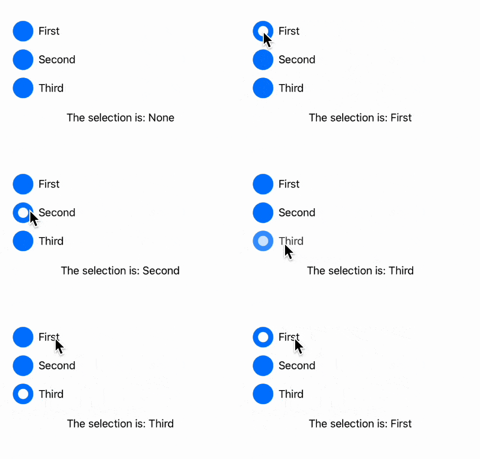
This recipe shows how to add radio buttons in SwiftUI. Each radio button will have a customizable appearance and will be a part of a single radio button group.
The end result looks like this:

First, we'll define a RadioButton view. It has two UI components to it - button and label, both of which are customizable. The button part should change appearance based on if the radio button is selected or not. Also, each radio button has a unique tag associated with it that tells it apart from other radio buttons in a group:
struct RadioButton<Tag, CircleButton, Label>: View
where Tag : Hashable, CircleButton : View, Label : View {
  let tag: Tag
  @Binding var selection: Tag?
  @ViewBuilder let button: (Bool) -> CircleButton
  @ViewBuilder let label: () -> Label

  var body: some View {
    Button {
      selection = tag
    } label: {
      HStack {
        button(selection == tag)
        label()
      }
    }
    .buttonStyle(.plain)
  }
}
Next, a RadioButtonGroup renders a collection of radio buttons, all of whom share the same appearance and the same selection state - only one can be selected at the time. We'll also support two orientation modes - horizontal and vertical, respectively.
struct RadioButtonGroup<Tag, CircleButton, Label>: View
where Tag : Hashable, CircleButton : View, Label : View {
  @Binding var selection: Tag?
  let orientation: Orientation
  let tags: [Tag]
  @ViewBuilder let button: (Bool) -> CircleButton
  @ViewBuilder let label: (Tag) -> Label

  var body: some View {
    if orientation == .horizonal {
      HStack(alignment: .top) {
        radioButtons
      }
    } else {
      VStack(alignment: .leading) {
        radioButtons
      }
    }
  }

  @ViewBuilder private var radioButtons: some View {
    ForEach(tags, id: \.self) { tag in
      RadioButton(tag: tag, selection: $selection, button: button) {
        label(tag)
      }
    }
  }

  enum Orientation {
    case horizonal, vertical
  }
}
If you're using SwiftUI 4 (iOS 16, macOS 12.4), you can simplify the above code by utilizing AnyLayout:
struct RadioButtonGroup<Tag, CircleButton, Label>: View
where Tag : Hashable, CircleButton : View, Label : View {
  @Binding var selection: Tag?
  let orientation: Orientation
  let tags: [Tag]
  @ViewBuilder let button: (Bool) -> CircleButton
  @ViewBuilder let label: (Tag) -> Label

  var body: some View {
    ((orientation == .horizonal)
     ? AnyLayout(HStackLayout(alignment: .top))
     : AnyLayout(VStackLayout(alignment: .leading))) {
      ForEach(tags, id: \.self) { tag in
        RadioButton(tag: tag, selection: $selection, button: button) {
          label(tag)
        }
      }
    }
  }

  enum Orientation {
    case horizonal, vertical
  }
}
Lastly, here's some sample code to showcase RadioButtonGroup in action:
struct RadioButtonTest: View {
  @State private var selection: Option?

  var body: some View {
    VStack(alignment: .leading, spacing: 20) {
      RadioButtonGroup(selection: $selection,
                       orientation: .vertical,
                       tags: Option.allCases,
                       button: { isSelected in
        ZStack {
          Circle()
            .foregroundColor(.blue)
            .frame(width: 32, height: 32)
          if isSelected {
            Circle()
              .foregroundColor(Color.white)
              .frame(width: 16, height: 16)
          }
        }
      },
                       label: { tag in
        Text("\(tag.description)")
      })

      Text("The selection is: \(selection?.description ?? "None")")
        .frame(maxWidth: .infinity)
    }
    .padding(20)
  }

  enum Option: CaseIterable, CustomStringConvertible {
    case first, second, third

    var description: String {
      switch self {
      case .first:
        return "First"
      case .second:
        return "Second"
      case .third:
        return "Third"
      }
    }
  }
}