13
Nov
2020
Top Tabs in SwiftUI
Reading time: 1 min
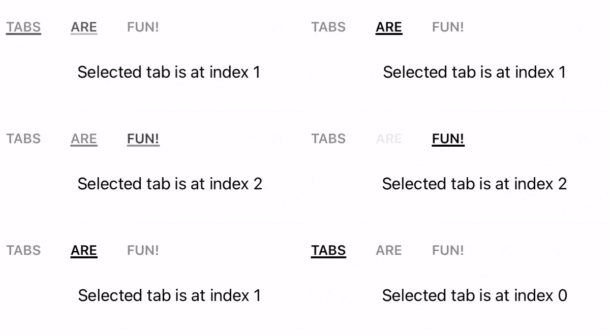
This tutorial shows how to add Android-like top tabs in SwiftUI.
The result will look something like this:

Without much ado, here's the code for the component:
struct Tabs<Label: View>: View {
  @Binding var tabs: [String] // The tab titles
  @Binding var selection: Int // Currently selected tab
  let underlineColor: Color // Color of the underline of the selected tab
  // Tab label rendering closure - provides the current title and if it's the currently selected tab
  let label: (String, Bool) -> Label

  var body: some View {
    // Pack the tabs horizontally and allow them to be scrolled
    ScrollView(.horizontal, showsIndicators: false) {
      HStack(alignment: .center, spacing: 30) {
        ForEach(tabs, id: \.self) {
          self.tab(title: $0)
        }
      }.padding(.horizontal, 3) // Tuck the out-most elements in a bit
  }

  private func tab(title: String) -> some View {
    let index = self.tabs.firstIndex(of: title)!
    let isSelected = index == selection
    return Button(action: {
      // Allows for animated transitions of the underline,
      // as well as other views on the same screen
      withAnimation {
         self.selection = index
      }
    }) {
      label(title, isSelected)
        .overlay(Rectangle() // The line under the tab
          .frame(height: 2)
           // The underline is visible only for the currently selected tab
          .foregroundColor(isSelected ? underlineColor : .clear)
          .padding(.top, 2)
          // Animates the tab selection
          .transition(.move(edge: .bottom)) ,alignment: .bottomLeading)
    }
  }
}
And here's a example of how to put it to use:
@State private var selectedTab = 0

...

VStack {
  Tabs(tabs: .constant(["Tabs", "Are", "Fun!"]),
           selection: $selectedTab,
           underlineColor: .black) { title, isSelected in
             Text(title.uppercased())
               .font(.system(size: 14))
               .fontWeight(.semibold)
               .foregroundColor(isSelected ? .black : .gray)
           }

  Text("Selected tab is at index \(tab)")
    .padding(.top, 20)
  Spacer()
}.padding()