Reading time: 1 min
This recipe shows how to create a custom divider in SwiftUI - one that allows you to customize its color and height/width/thickness.
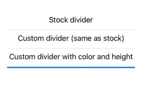
The end result looks like this:

Stock SwiftUI Divider view is strangely uncustomizable - it's always of the same gray color and of the same 0.5pt height/thickness. The frame modifier does nothing but increase its overall height without actually making the line any thicker, and foregroundColor is of no use as well.
Luckily, we can work around those limitations with a custom view:
struct CustomDivider: View {
  let color: Color
  let height: CGFloat

  init(color: Color = .gray.opacity(0.5),
       height: CGFloat = 0.5) {
    self.color = color
    self.height = height
  }

  var body: some View {
    Rectangle()
      .fill(color)
      .frame(height: height)
      .edgesIgnoringSafeArea(.horizontal)
  }
}
If you use this view without any parameters with CustomDivider(), it looks exactly the same as stock Divider, making this a perfect drop-in replacement.
Finally, here's some sample code that shows the custom divider in action:
VStack {
  Text("Stock divider")
  Divider()
  Text("Custom divider (same as stock)")
  CustomDivider()
  Text("Custom divider with color and height")
  CustomDivider(color: .blue, height: 3)
}
.padding()