03
Mar
2021
Material Indefinite Loading Bar in SwiftUI
Reading time: 1 min
This recipe shows how to implement an indefinite loading bar in SwiftUI. This kind of view is common in Android Material Design as it's sleek and takes up less space than a conventional, circular LoadingView.
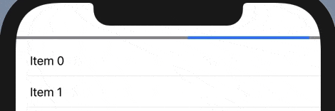
The end result looks like this:
The code for this is quite simple:
- Render a
Rectanglethat fits its parent's width. - Partly cover it by another
Rectanglein itsoverlay. Use aGeometryReaderto determine the overlay width. - Animate the overlay's translation by changing its offset:
minOffsetputs the top rectangle fully to the left of the bottom rectangle, effectively hiding it from sight.maxOffsetputs the top rectangle fully to the right, again hiding it from sight.
- Make sure that the
Animationuses autoreverses: true inrepeatForeverin order to reset the top rectangle tominOffsetat each iteration.
Here's the code:
// the height of the bar
private let height: CGFloat = 4
// how much does the blue part cover the gray part (40%)
private let coverPercentage: CGFloat = 0.4
private let minOffset: CGFloat = -2
private let maxOffset = 1 / coverPercentage * abs(minOffset)

struct InfiniteProgressBar: View {
  @State private var offset = minOffset;

  var body: some View {
    Rectangle()
      .foregroundColor(.gray) // change the color as you see fit
      .frame(height: height)
      .overlay(GeometryReader { geo in
        overlayRect(in: geo.frame(in: .local))
      })
  }

  private func overlayRect(in rect: CGRect) -> some View {
    let width = rect.width * coverPercentage
    return Rectangle()
      .foregroundColor(.blue)
      .frame(width: width)
      .offset(x: width * offset)
      .onAppear {
        withAnimation(Animation.linear(duration: 2.5).repeatForever(autoreverses: false)) {
          self.offset = maxOffset;
        }
      }
  }
}