Styling SwiftUI DatePicker
Reading time: 2 min
This recipe shows how to style SwiftUI DatePicker by setting its background and foreground / text color. There's no good, standard way of doing this, but a few tricks can get you there for the most part.
Here are a few examples of what you can do:
 |
 |
 |
 |
The images above show our new, fully customizable DateTimePickerDialog in action. Be sure to give it a try!
OK, let's get down to business.
DatePicker styles
DatePicker has four DatePickerStyles that you can choose from and apply them with datePickerStyle modifier:
DefaultDatePickerStylelooks likeWheelDatePickerStyleon iOS 13 and asCompactDatePickerStyleon iOS 14.WheelDatePickerStyleshows date and time pickers as selection wheels.GraphicalDatePickerStyle(iOS 14 only) shows a calendar-style picker.CompactDatePickerStyle(iOS 14 only) shows pickers as buttons that expand to a graphical date picker when clicked.
Changing background color
You're (mostly) in luck here, the background modifier works as you'd expect:
DatePicker(selection: $date)
    .datePickerStyle(WheelDatePickerStyle())
    .background(Color.blue)
That being said, the default DatePicker background is transparent, so you can change its background color by applying it to its parent as well:
VStack {
  Text("Title")
  DatePicker(selection: $date)
}.background(Color.blue)
If you use CompactDatePickerStyle, using background has no effect on the Graphical part that pops up after you tap the button - its background color remains white.
Changing foreground / text color
Here's the tricky one, as foreground modifiers doesn't work on DatePicker - but you can still get your way (or at least most of it).
Wheel and Graphical style
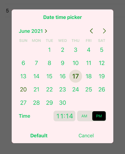
For the WheelDatePickerStyle and GraphicalDatePickerStyle, you can do this with colorMultiply modifier. However, it matters if you're in light or dark mode: if in light mode, you need to apply colorInvert first. Here's a helpful extension that takes care of this automatically:
extension View {
  @ViewBuilder func applyTextColor(_ color: Color) -> some View {
    if UITraitCollection.current.userInterfaceStyle == .light {
      self.colorInvert().colorMultiply(color)
    } else {
      self.colorMultiply(color)
    }
  }
}
Then, use it on your DatePicker:
DatePicker(selection: $date)
  .datePickerStyle(GraphicalDatePickerStyle())
  .applyTextColor(.orange)
Note that this has a side-effect on Graphical style - the AM/PM toggle will turn black.
Default and Compact style
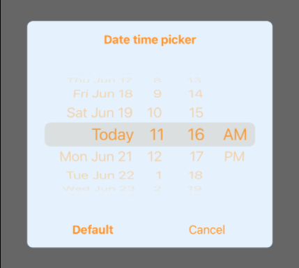
For the CompactDatePickerStyle (which, again, is the default on iOS 14), the solution with applyTextColor doesn't work. It yields a different color on the button part of the picker - it's more red than orange:

It also has no effect on the Graphical part that pops up when you tap the buttons:

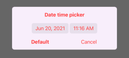
The (partial) solution for the Compact style is to use accentColor:
DatePicker(selection: $date)
  .datePickerStyle(CompactDatePickerStyle())
  .accentColor(.orange)
This looks good in the button part:

However, it doesn't change the text color of the Graphical popup:

But hey, at least the selection circle and chevrons did turn orange, right?

CompactDatePickerStyle seems the least styleable of the bunch, with it Graphical part not responding to either background or foreground color changes. Keep that in mind while designing your UI.