26
Jun
2021
Grouped List in SwiftUI
Reading time: 1 min
This recipe shows how to display a grouped list in SwiftUI. A grouped list contains sections, comprised of zero or more rows, plus an optional header and footer.
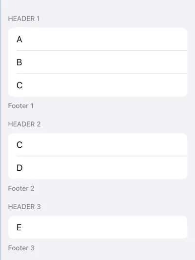
The end result will look like this:
OK, so the formula is quite simple:
- Pass
Sections as yourList's items. - Specify the appearance using
listStylemodifier in your list's superview.
First, define a simple struct to model your sections:
struct Item: Hashable {
  let header: String
  let footer: String
  let rows: [String]
}

// ... and some sample data

let items = [
    Item(header: "Header 1", footer: "Footer 1", rows: ["A", "B", "C"]),
    Item(header: "Header 2", footer: "Footer 2", rows: ["C", "D"]),
    Item(header: "Header 3", footer: "Footer 3", rows: ["E"])
]
Then, implement the above formula in your view as following:
var body: some View {
  NavigationView {
    List {
      ForEach(items, id: \.self) { item in
        Section(header: Text(item.header), footer: Text(item.footer)) {
          ForEach(item.rows, id: \.self) { row in
            Text(row)
          }
        }
      }
    }
  }.listStyle(GroupedListStyle())
}
There are several ListStyles you can choose from starting from iOS 13:
- If you omit the
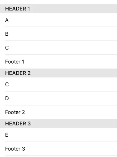
listStylemodifier, or passDefaultListStyleorPlainListStyle, you get the following:
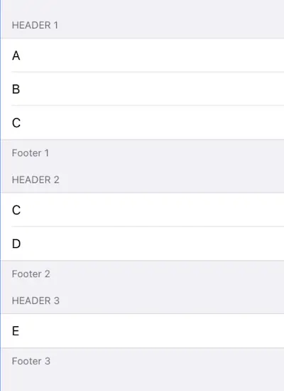
GroupedListStylemakes this look like your regularUITableView.Style.grouped:
iOS 14 added two more options for grouped lists:
GroupedInsetsListStyleadds padding and round borders to the section's items:

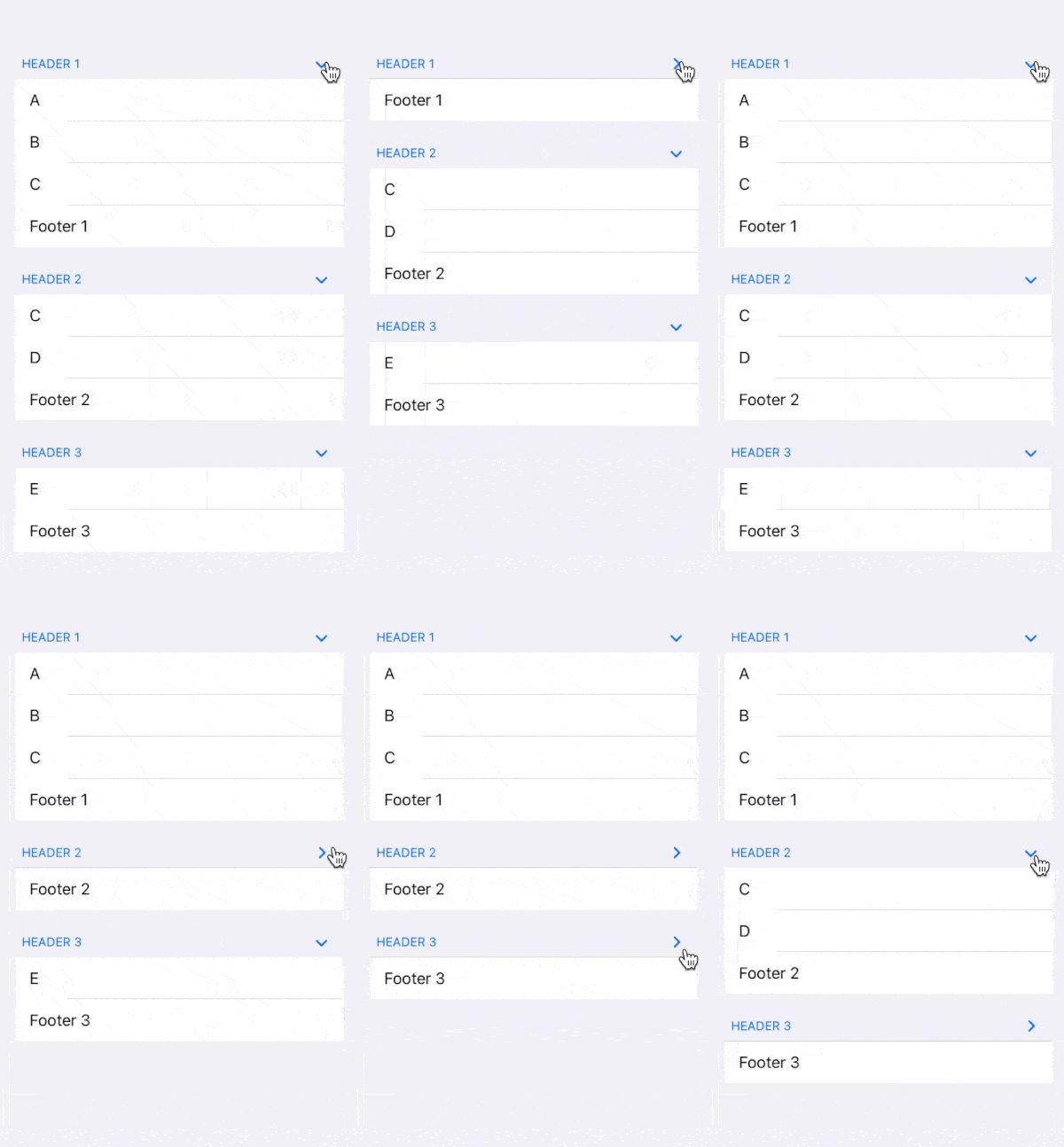
SidebarListStyleallows the user to collapse/expand sections:
