Styling SwiftUI Form
Reading time: 3 min
This recipe shows how to style a SwiftUI Form. Forms are a great way to quickly compose a UI for collecting data, such as an enrolment form or a settings panel, but fully styling them can be a bit a tricky.
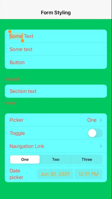
The end result will look like this:
Starting position
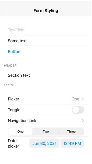
OK, let's start with a an exemplary Form that contains most components you'd normally find in one:
struct FormTest: View {
  @State private var textFieldSelection = ""
  @State private var pickerSelection = "One"
  @State private var isToggleOn = false
  @State private var datePickerSelection = Date()

  var body: some View {
    NavigationView {
      Form {
        TextField("TextField", text: $textFieldSelection)
        Text("Some text")
        Button("Button") { }
        Section(header: Text("Header"), footer: Text("Footer")) {
          Text("Section text")
        }
        Picker(selection: $pickerSelection, label: Text("Picker")) {
          ForEach(["One", "Two", "Three"], id: \.self) {
            Text($0).tag($0)
          }
        }
        Toggle(isOn: $isToggleOn) {
          Text("Toggle")
        }
        NavigationLink("Navigation Link", destination: Text("Destination"))
        Picker(selection: $pickerSelection, label: Text("Picker")) {
          ForEach(["One", "Two", "Three"], id: \.self) {
            Text($0).tag($0)
          }
        }.pickerStyle(SegmentedPickerStyle())
        DatePicker("Date picker", selection: $datePickerSelection)
      }.navigationBarTitle("Form Styling", displayMode: .inline)
    }
  }
}
It looks like this:
Changing foreground / text color
This one's simple enough - the foregroundColor modifier works as you'd expect:
Form {
 // ...
}.navigationBarTitle("Form Styling", displayMode: .inline)
.foregroundColor(.red) // ADD THIS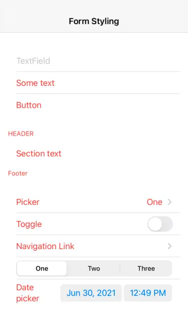
Note that it doesn't affect a Picker with SegmentedPickerStyle, nor the button text of DatePicker.
Effect of accentColor
The accentColor modifier applies the accent to controls that support it, including the DatePicker buttons:
Form {
 // ...
}.navigationBarTitle("Form Styling", displayMode: .inline)
.foregroundColor(.red)
.accentColor(.orange) // ADD THIS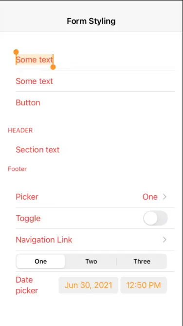
Changing the background color
This is the tricky one. If you just apply the background modifier to your Form, nothing happens:
Form {
 // ...
}.navigationBarTitle("Form Styling", displayMode: .inline)
.foregroundColor(.red)
.accentColor(.orange)
.background(Color.green) // ADD THIS, BUT TO NO EFFECT
This is because Form is internally represented by a grouped UITableView and its background color renders on top of yours. The solution is to set the default UITableView background color to UIColor.clear. Since this is a global-scope change, we'll be smart about it and apply it in onAppear, only to revert it back in onDisappear:
.foregroundColor(.red)
.accentColor(.orange)
.background(Color.green)
.onAppear { // ADD THESE
  UITableView.appearance().backgroundColor = .clear
}
.onDisappear {
  UITableView.appearance().backgroundColor = .systemGroupedBackground
}
This leaves us with the following result:
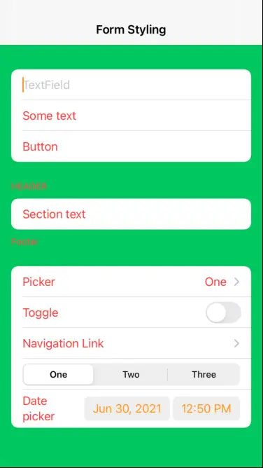
As you can see, the background of the Form itself did change, but its rows are still white. To color them, you must use the listRowBackground modifier. You can apply it to individual elements like this:
TextField("TextField", text: $textFieldSelection)
  .listRowBackground(Color.blue)
Or to individual sections:
Section(header: Text("Header"), footer: Text("Footer")) {
  Text("Section text")
}.listRowBackground(Color.blue)
Or, if you want to apply it to every row in the Form, wrap everything in a Group and apply the modifier to it:
Form {
  Group {
    // all the controls go here, just as before
  }.listRowBackground(Color(.sRGB, red: 0, green: 1, blue: 1, opacity: 0.5))
}
This results in most of the Form fully styled:

A note about Picker and DatePicker
If you wrap your Form in a NavigationView, its Picker default style will render a navigation link that takes the user to a list of picker items. Note that out of all the form styling that we just did, only foregroundColor affects the picker screen:
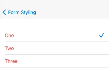
On the other hand, DatePicker popups are only affected by accentColor.