13
Jun
2022
Scatter Plot in SwiftUI with Charts Framework
Reading time: 2 min
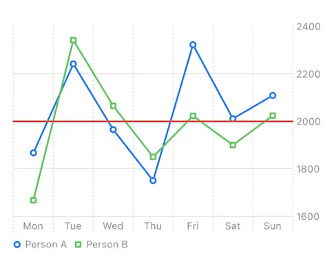
This recipe shows how to add a Scatter Plot Chart to SwiftUI using Apple's new Charts Framework.
The end result looks like this:

Charts framework is available starting in SwiftUI 4 (iOS 16, macOS 12.4).
Let's start off by creating a simple structure that represents how many calories we ate each day. This is the data we'll be plotting in our scatter plot chart. Also create two sets of sample data to represent two plot series:
struct FoodIntake: Hashable {
  let day: String
  let calories: Int
}

struct PersonalFoodIntake: Identifiable {
  let name: String
  let data: [FoodIntake]

  var id: String {
    name
  }
}

// Sample data
let intakes: [PersonalFoodIntake] = [
  PersonalFoodIntake(name: "Person A", data: [
    FoodIntake(day: "Mon", calories: 1867),
    FoodIntake(day: "Tue", calories: 2242),
    FoodIntake(day: "Wed", calories: 1965),
    FoodIntake(day: "Thu", calories: 1750),
    FoodIntake(day: "Fri", calories: 2323),
    FoodIntake(day: "Sat", calories: 2011),
    FoodIntake(day: "Sun", calories: 2109),
  ]),
  PersonalFoodIntake(name: "Person B", data: [
    FoodIntake(day: "Mon", calories: 1667),
    FoodIntake(day: "Tue", calories: 2342),
    FoodIntake(day: "Wed", calories: 2065),
    FoodIntake(day: "Thu", calories: 1850),
    FoodIntake(day: "Fri", calories: 2023),
    FoodIntake(day: "Sat", calories: 1900),
    FoodIntake(day: "Sun", calories: 2024),
  ])
]
Use the Chart view to represent the chart, and add a LineMark for each food intake item.
Chart {
  ForEach(intakes) { intake in // distinct series
    ForEach(intake.data, id: \.self) { data in // data for individual series
      LineMark(x: .value("Day", data.day),
                y: .value("Calories", data.calories))
    }
    // declare that person name is used to differentiate between different series
    .foregroundStyle(by: .value("Person", intake.name))
    .symbol(by: .value("Person", intake.name))
  }
  .lineStyle(StrokeStyle(lineWidth: 2)) // line width
  .symbolSize(50) // point/rect size

  RuleMark(y: .value("Threshold", 2000))
    .foregroundStyle(.red)
}
// scale the Y axis according to actual data values
.chartYScale(domain: intakes.flatMap { $0.data }.map { $0.calories })
// colors the plot lines and enables legend
.chartForegroundStyleScale([
    "Person A": .blue,
    "Person B": .green
])
You can use RuleMark to draw a single line anywhere in your chart.