Reading time: 1 min
This recipe shows how to style SwiftUI TextField's prompt / placeholder text, in order to, e.g, change its color or font. Alternatively, you can put a fully custom view for the placeholder.
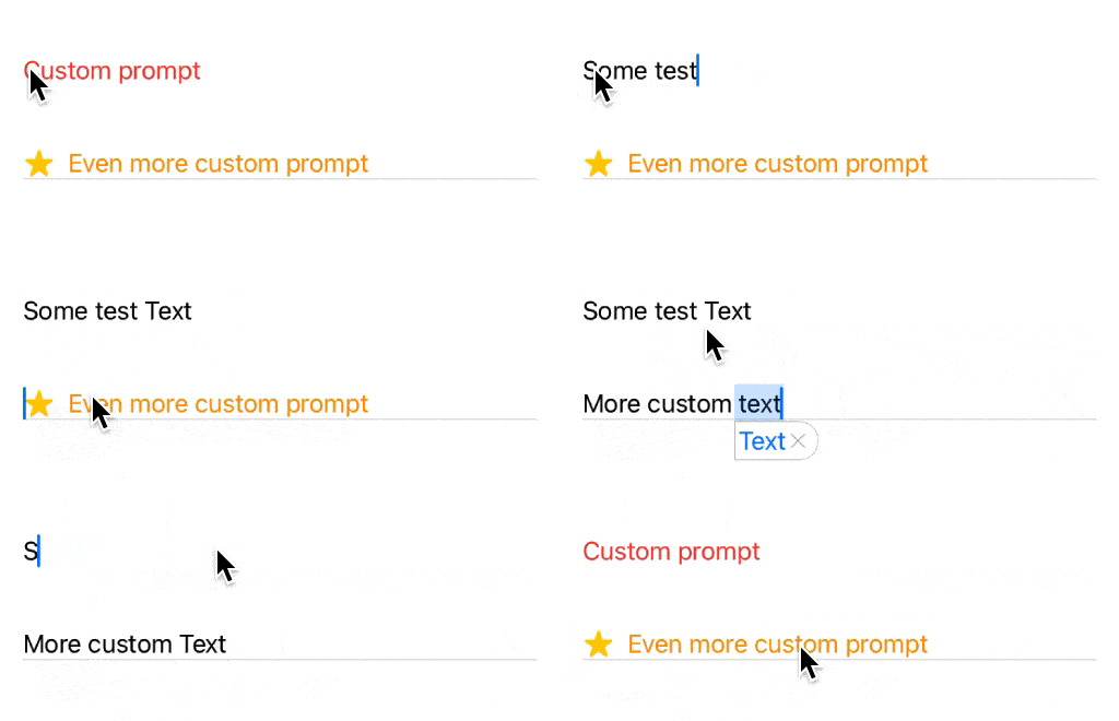
The end result looks like this:

Since there is no built-in way of doing this, we'll have to resort to a trick - we'll simulate a TextField's prompt by rendering a custom view beneath it if its text content is empty.
We'll start off with a generic solution that conditionally replaces one view with another:
struct PlaceholderModifier<Placeholder>: ViewModifier where Placeholder : View {
  let isShowing: Bool
  @ViewBuilder let placeholder: () -> Placeholder

  func body(content: Content) -> some View {
    ZStack(alignment: .leading) {
      placeholder()
        .opacity(isShowing ? 1 : 0) // retains placeholder size even when it's hidden
      content
    }
  }
}

extension View {
  func placeholder<Placeholder>(isShowing: Bool,
                                @ViewBuilder placeholder: @escaping () -> Placeholder) -> some View
  where Placeholder : View {
    modifier(PlaceholderModifier(isShowing: isShowing, placeholder: placeholder))
  }
}
Then, we can add a convenience View that applies this to a TextField:
struct TextFieldWithCustomPrompt<Prompt>: View where Prompt : View {
  @Binding var text: String
  @ViewBuilder let prompt: () -> Prompt

  var body: some View {
    TextField("", text: $text)
      .placeholder(isShowing: text.isEmpty, placeholder: prompt)
  }
}
With all of that in place, customizing TextField prompts / placeholders is as easy as this:
TextFieldWithCustomPrompt(text: $myText) {
  Text("Custom prompt")
    .foregroundColor(.red)
}

TextFieldWithCustomPrompt(text: $otherText) {
  HStack {
    Image(systemName: "star")
      .symbolVariant(.fill)
      .symbolRenderingMode(.multicolor)
    Text("Even more custom prompt")
      .foregroundColor(.orange)
  }
}
.background(VStack {
  Spacer()
  Divider()
})
You can learn more about SwiftUI Symbols this article.