Supporting Dark Mode in SwiftUI
Reading time: 2 min
This recipe shows all you need to do to support dark mode in your SwiftUI app.
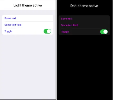
The end result looks like this:

You should know that SwiftUI supports dark mode by default - which can be a blessing and a curse. Basically, if you're building a simple app without a lot of custom styling, most things should work out of the box - both foreground and background colors of all built-in views will change if you switch from light to dark mode or vice-versa. However, the moment you start customizing your colors a bit, you need to make sure to do it thoroughly and override each default behavior.
Alternatively, you can lock your app in the light appearance in Info.plist by adding UIUserInterfaceStyle key with value of Light.
Supporting adaptive colors
Adaptive colors are those that change based on the active user interface style, or ColorScheme as its known in SwiftUI. You can add those in two ways.
Adaptive color in Assets
The easiest (and probably the best) way is to just add a new Color Set to your Assets. There you can provide different colors for light, dark and default color schemes:

Afterwards, just load the Color in your code:
extension Color {
  static let textColor = Color("TextColor")
}
And that's it! Just apply this color wherever you'd like and it'll automatically change if the interface style / color scheme does:
Form {
  Text("Some text")
  TextField("TextField", text: .constant("Some text field"))
  Toggle("Toggle", isOn: .constant(true))
}
.foregroundColor(.textColor)
Programatic adaptive color
If you want, you can also create an adaptive Color programatically. To do so, you need to bridge from UIColor, as it has an initializer that allows itself to update dynamically based on the current interface style / color scheme:
extension UIColor {
  convenience init(light: UIColor, dark: UIColor) {
    self.init { traitCollection in
      switch traitCollection.userInterfaceStyle {
      case .light, .unspecified:
        return light
      case .dark:
        return dark
      @unknown default:
        return light
      }
    }
  }
}

extension Color {
  init(light: Color, dark: Color) {
    self.init(UIColor(light: UIColor(light), dark: UIColor(dark)))
  }
}
Now you can define:
extension Color {
  static let defaultBackground = Color(light: .white, dark: .black)
}
and use the new adaptive color:
VStack {
  // ....
}
.background(Color.defaultBackground)
Custom UI based on color scheme
While adaptive colors should be enough for most use-cases, sometimes you might want to render different UI based on the current color scheme. Do do so, just tap into the environment value named colorScheme:
@Environment(\.colorScheme) var colorScheme: ColorScheme

var body: some View {
  Text((colorScheme == .dark) ? "Dark theme active" : "Light theme active")
}
Dark mode in previews and simulators
To simulate dark mode in an Xcode preview, use the colorScheme modifier (or preferredColorScheme if you're on iOS 15+):
struct DarkModeTestDark_Previews: PreviewProvider {
  static var previews: some View {
    DarkModeTest()
      .colorScheme(.dark) // HERE
  }
}
To enable dark mode on a Simulator, go to Settings → Developer and toggle Dark Appearance.